Northstar
A product analytics interface that ties behavior to business outcomes and keeps time windows, drivers, lift, and confidence beside the numbers.
Next.js · React · TypeScript · Tailwind CSS · SVG · Data visualization
Context
Event counts alone leave business questions unanswered. A team can know that thousands of people used a feature and still not know whether the behavior changed revenue, conversion, or activation.
Northstar organized the product around three objects: an event is a raw fact, a signal is a behavior worth naming, and an outcome is the business result associated with it. Where an experiment included a holdout, the product compared groups to estimate incremental lift rather than presenting correlation as the answer.
The frontend challenge was to make those qualifications visible without turning every dashboard card into a footnote.
My role
I led the technical direction on a three-person team, with the dashboard and frontend architecture as my primary area of ownership. I designed and built the guiding metric, outcome cards, Signals to Outcomes table, trends, funnels, segments, experiments, and source setup.
I also contributed across the backend and infrastructure, set the stack and quality bar, and reviewed the other developers' pull requests.
Scope
My frontend work covered:
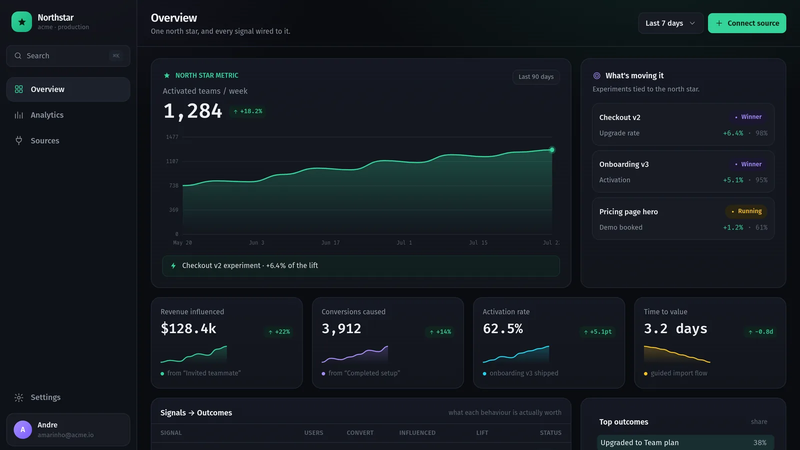
- a north-star metric with its time window, trend, and growth driver;
- revenue, conversion, activation, and time-to-value outcome cards;
- the relationship between signals, users, conversion, influenced value, and lift;
- event and conversion trends, segments, sources, countries, and activation funnels;
- experiment status, significance, and confidence;
- source setup for SDK, server, webhook, and CSV ingestion;
- bespoke SVG charts in Next.js, React, and TypeScript.
The broader product used separate analytical and relational stores for event data and product definitions. That architecture was delivered by the team and is not presented as solo authorship.
Evidence
The reconstructed overview above documents the guiding metric, a 90-day trend, outcome cards, experiments, and the Signals to Outcomes table.
The company, users, events, values, lift figures, and confidence levels shown are illustrative. They demonstrate the information architecture and data states. They do not represent the client's real performance.
Decisions
Keep the qualifier beside the number
A lift figure needs its comparison, a conversion rate needs its window, and an experiment needs its confidence and status. Those details were part of the component hierarchy rather than detached notes.
Carry one model through the whole interface
Event, signal, and outcome remained distinct from instrumentation through reporting. The dashboard could then show both what happened and which business result the product associated with it.
Draw the charts for the questions being asked
Bespoke SVG charts kept the visual language consistent and gave the interface control over annotations, states, and hierarchy without shipping a general-purpose charting library.
Outcome
The team delivered a dashboard where readers could follow a metric through to the behavior and experiments associated with it. Comparisons, time windows, and confidence levels stayed visible as they explored.
Disclosure
This was client work completed by a three-person team. The client asked not to be named. "Northstar," its identity, company, data, values, integrations, and interface were created or altered for this portfolio reconstruction.
The product model, delivered capabilities, and my responsibilities describe the engagement; the screenshot does not reveal the client's production data or original interface. No client repository or production metric is public, and the values in the reconstruction are not customer results.